Creative Design Adda
Creating Brands
+
Since 2021
A Passionate Visual designer driven by a love for learning something new everyday, staying updated on design trends, and building story's into brands.
Hello, I'M KANAK KINGRANI
THIS SITE IS MEANT FOR YOUR LAPTOP
ONLY

Category
UX Design
Branding & Packaging
Synopsis
Nutrition for Young Athletes
Service
Duration
4 months
A Vision Rooted in Curiosity
In a country where Olympic dreams are rising, young athletes train hard, yet many miss out on the one thing that could truly fuel their performance: proper nutrition. Parents are eager to support, coaches try their best to guide—but confusion, lack of awareness, and the absence of child-specific products leave a critical gap.
The project began with a simple question?
Capturing Problem
With Field research and observations at events like the Khasdar Krida Mahotsav, revealed common issues such as poor dietary choices and lack of awareness about proper nutrition among young athletes. This insight led to the development of a brand that not only provides nutritional products but also educates its audience.
Storytelling Power
Archetype
“Our Vision is to become India’s most well-known and recognized sports nutrition brand for young athletes-by providing daily, performance-based nutrition that energizes bodies and active minds and integrating it into every child’s daily routine across the country.”
Vision
“Our mission is to provide individuals with healthy and affordable snacks made from Indian ingredients trusted by our mothers, with clean labeling, we aim to support performance, growth and active lifestyle.”
Mission
The hero is a powerful and determind archetype focused on achievement, growth, and resilience. They aim to empower and inspire their audience to accept challenges and become the best version of themselves.
Brand Identity
Design with Impact
Josh symbolizes energy and enthusiasm “Get Set” conveys readiness and momentum Energetic and easy to remember Inspires growth and better performance Modern, relatable for young athletes Highlights the role of nutrition in enhancing
Connecting Visual Element
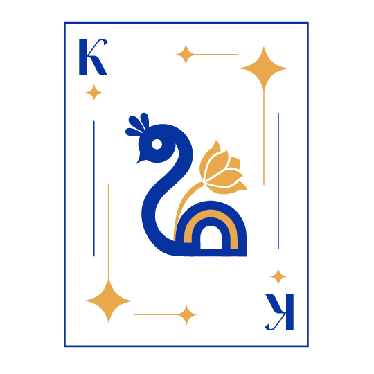
Card
A nutrition focused brand created for young athletes. It offers perfomance based snack kits made with Indian ingredients for pre during and post training. the project combines Research, Branding, and packaging to make nutrition simple, Trusted, impactful and give a consistent wins and empowering every athlete to become better with every step.
Nourishment
Brand Communication Style
Purpose of the Name
Final Logo
Empowerment
Energetic


“What does it take to build a stronger, healthier, more confident young athlete?”


Let's have a look
Our Target audience :
Primary Audience
Mothers
Secondary Audience
Young Athletes (8-18 years)
Tertiary Audience
Coaches, Academies and Schools


Market Analysis
Stake Holder Mapping
Trust
Brand Tagline: Level up your strength

Moodboard

Color pallete

Brand Name: Get-Set-Josh

Typography Harmony
Moodboard
Typeface


Logo Typeface
Primary Typeface
Secondary Typeface


Clearance
The clearance space to be follow all around the logo when used for collaterals is the width of the letter ‘J‘ present in the logo. In the clearance space represented, the width of the letter ‘J‘ is 30 px
Scaling & Proportions
The logo is a vector based artwork that can be scaled up to any size but should be scaled down upto the following: Minimum width for print : 3,5cm Minimum width for digital : 85px
Scale

Icons


Packaging
Stand Up Pouch (FOP)

Stand Up Pouch (BOP)
Layout
Citrus chia Blast Electrolyte

The Citrus Blast Chia Electrolyte packaging consist of two designed panels with the base following that of the Stand Up Pouch Format.
Each of the panels have been designed having their own purpose. This in-game hydration mix is filled with nutrients providing energy, hydration and other nutrients.
It also contain single serve sachet with days written on the packaging inside the pouch


Cap


String Bag
Bottle

Sticker Sheet
T-shirt Design

Billboards


Brochure
Social Media


Pop-Up Tent


